Cardboard Scrapbooking Style: Ideas

How to get an Cardboard Scrapbooking Style on your layouts
OMG…it was such a long time without any Posts from me. But I just moved to California for some Job Training with SAP and there is very much going on. And I want to make sure that my Posts make sense and bring value to you. So I rather spend some more time on them than to provide a lot of small ones. I hope that is okay with you?! 🙂
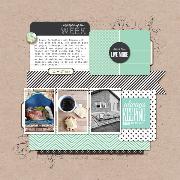
So this time the post is about cardboard styles in Digital Scrapbooking. Have you seen those awesome layouts which seem to be totally real? They have a cardboard background and those layouts often come along with real-looking frames, shadows or stamps. I really like this kind of design as it allows you to keep things simple but rather interesting. The boarder between normal scrapbooking or the digital one is kind of disappearing. There are some great examples around the web as well as some freebies. So continue reading/watching and get inspired for your very own “cardboard scrapbooking style!
Tip #1: Use FRAMES for the photos to focus on them
The most layouts have in common that there frames used for the photos. This is a nice approach as the purpose of scrapbooking still should be to concentrate on a nice picture presentation. In the most examples I found the frames were white or black. I guess there are also some other possibilities to use here.
 |
 |
| Credit: “First Week Of 2014” by inthemakingdesign | Credit: “aedno1” by Adryane |
Further links:
Great Cardboard Style from “in the making design” – Process & Approach
Freebies:
 |
 |
| Download: “At Dusk” Frames from Pom’s Breathing Room | Download: Free scalloped frame by Delicious Scraps |
Tip #2: Use SHADOWS wisely to make it look real
Additionally to the nice frames it is common to include shadows to make the elements look more real. The method here should be to use them wisely to create those nice realistic “look-and-feel”. There are some great tutorials around the web which you find just after those awesome examples and freebies here:
 |
 |
| Credit: “10 days old” by Ellie | Credit: “tlpguest08” by margelz |
Freebies:
 |
 |
| Download: Free Photoshop Shadow Layer Styles | Download: Drop Shadows |
Tutorials:
Tip #3: STAMPS make the layout look even more real
And what about stamps…I realized that there are many layouts with simple black graphics somewhere. I really like it as it seems to look like stamps on the cardboard paper. So it makes the whole layout even more real. Especially a lot of custom shapes or photoshop brushes are free within the web to use them for awesome designs. So you can use simple png-images for any program, custom shapes or brushes if you use photoshop.
 |
 |
| Credit: “Explore Amsterdam” by Deekaa | Credit: “week of november 11” by in the making design |
Freebies:
 |
 |
| Download: Eiffel Tower Collage from Free Vintage Digistamps | Download: Namaste Freebie by Studio Unica |
Tip #4: Write directly on the cardboard paper
The nice thing with using Cardboard Style is that you can insert your journaling directly on the cardboard background as it seems to be just perfect there. Especially if you use a handwriting font it enhances this “real” feeling of the layouts.
 |
 |
| Credit: “click21” by Sarah Bennett | Credit: “hello autumn” by Dana |
Further Links:
Tip #5: Use mainly real looking elements
Of course you can also add some nice elements to your layouts. If you look at the most layouts you might realize that they use not so many elements and keep it quite simple. But especially stitches or glitter are somehow “real” and great to use within cardboarding style.
 |
 |
| Credit: “You & Me” by beszteri | Credit: layout by Sucali |
Freebies:
 |
 |
| Download: Stitches from Auntie M Designs | Download: Glitter Freebie from Delicious Scraps |
If you want to check out some more layouts for Cardboard Scrapbooking have a look at my PINTEREST board here:
I hope you like cardboard scrapbooking style as much as I do and maybe you found some Inspiration for your very own Projects :).
Kisses
