Project Life Inspiration: Clean Look

Project Life inspiration for a clean style on your layouts
I just love to spend time on Pinterest to get some more project life inspiration for my own project. This time the “Clean Style” caught my eye. Sometimes I look at some layouts and I find myself a little disappointed that there is so much on them. I like it more if the pages have a clean and calm effect. For me it is also nicer to look at them and instantly see the main photos or information without getting confused by too much “input”. I analyzed again some layouts to find out which tips can help to improve my own layouts.
Tip #1: Ensure Alignment of the elements
Alignment is one of the principles of design to ensure an attractive presentation of text and pictures. Just like in the example you get a nice effect when you leave the same spacing around the photos to line them up. So you ensure an alignment which makes the layout look organized and “readable”.

Credit: Tracy Larsen.
Find some general information for “alignment” here: How to Use the Principle of Alignment in Page Layout.
Tip #2: Use white frames around elements
To get a calm look it is useful to put a white frame around the pictures, the texts, etc. It ensures that all the elements fit perfectly together.

Credit: Paislee Press.
Tip #3: Create some similar cards
A layout can be very balanced if you use similar designs for several cards. For me this kind of consistency makes a clean and simple layout. If there is every element different the page looks a little bit uneasy to me.

Credit: Anette Haring.
Tip #4: Insert white cards with a few words on them
In the most cases there is so much to explain and to say that there is too much journaling on some layouts. Try to focus on the really important things and shorten your text. The whole layout looks clean if you put those few words on a journaling card with enough white space around.

Credit: Tracy Larsen.
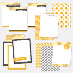
Tip #5: Try to avoid too many colors
I really like the idea of concentrating on as few colors as possible. Maybe, just use one main color for highlighting additionally to white and another “basic color” like grey, black or brown. I also like the usage of pastel colors because this method allows the actual photos to stand out.

Credit: I Create with Love.
Freebies for your very own CLEAN STYLE
Here are some nice and simple project life cards.
From Emily Merritt Designs:

Here are some great journaling cards: the focus is just on two main colors.
From One Velvet Morning:
Find here some templates for clean journaling cards.
From Persnickety Prints:

Feel free to have a look at my Pinterest Board for more Project Life Inspiration:
Do you like this kind of “clean” style? Or do you feel like something is missing? I would love to hear your opinion.
Have a good time!
